


ISIB Icon Design
Early in this April, Prof. Baeriswyl was invited to New Product Development course and reviewed ISIB icon design presentation by year one students. He highly praised students’ work and said that creativity is the core of design and design should also bring joy to people.
Here are the highlights of the 7 teams' designs.
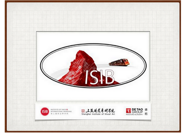
The ICON design of the first group is themed 'Jungfrau' - a famous tourist attraction in Switzerland. It was the Swiss that first conquered it. The group used it to symbolize the spirit of ISIB's students to climb the peak with great courage./p>
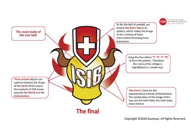
Group 2 made a splash with this creative solution. The ICON they designed was a cowbell, which also symbolizes the uniqueness of all ISIB students.
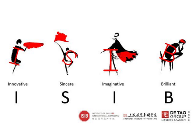
Group 3 designed four artistic villains, striking four poses for each letter: I S I B. Their work represents the innovation, authenticity, imagination and outstanding qualities of ISIB's students.
Group 4 created two designs. The first was inspired by Swiss watch parts. Swiss watches are famous throughout the world, and the gear is one of the most important part of watch. It reminds us that each student is an essential part of ISIB. The inspiration of the 2nd ICON came from Swiss pocket watches. The movements of the hour hand and the minute hand symbolize the alternation between the old and new students of ISIB.
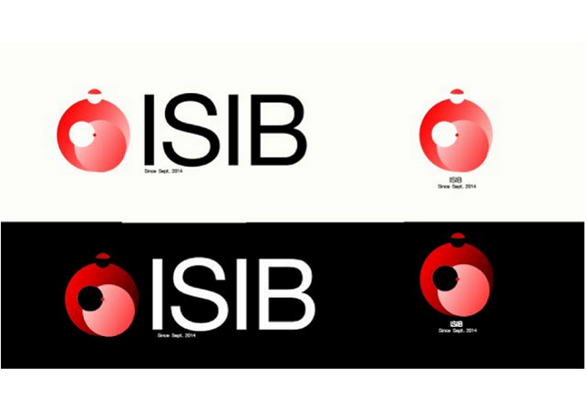
Group 5 based their design on the color red, inspired by UBS’s logo design. This approach also deeply integrated Swiss elements.
Group 6 also made 2 designs. The first, the ICON, is a silhouette of the bronze statue of Charlie the Great, who played a pivotal role in the advancement of European history. Their second ICON design originates from the Alps and the lakes. Its outline is subtly close to the letters of "ISIB".
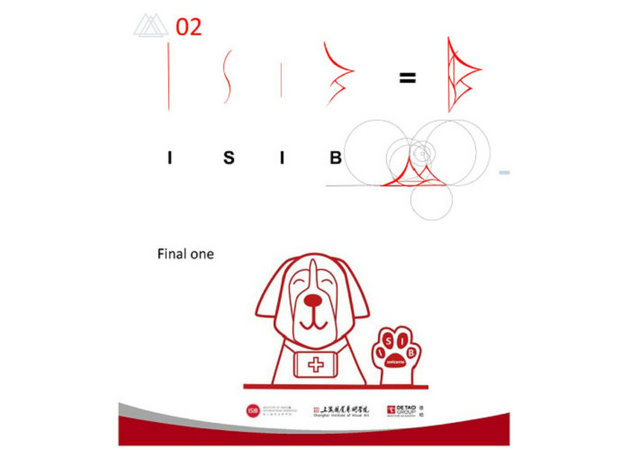
Group 7 was inspired by the Switzerland's national dog: the St. Bernard - which is loyal to people, physically strong and has a strong sense of smell. It embodies of the qualities ISIB students possess, including superior strength, keen insight, and loyalty to work.


